Wednesday, January 30, 2013

Work Habits

Some people spend the bulk of their time talking about doing stuff. Others people can talk about it AND do it at the same time. Then there are those that just do. I think I tend to fall in the last category. When I work on things, projects tend to take on a life of their own and it's difficult to think to stop and chronicle the process because I'm so involved with the process itself. I've worked on paintings, logos, illustrations, print ad and poster layouts, digital ads, large format signage, web design, and myriad other projects without stopping to record how they unfolded.

One of my favorite projects was the chance to be able to help brand the Saco Drive-In. One of the country's oldest. It's a fantastic place that really conjures the nostalgia of nights at the drive-in as a youth. This was printed on a variety of apparel.


I then had the opportunity to develop a graphic badge commemorating their 75th anniversary.


This was one I did for a local photo competition called Shoot Maine. A kind of visual scavenger hunt theme.


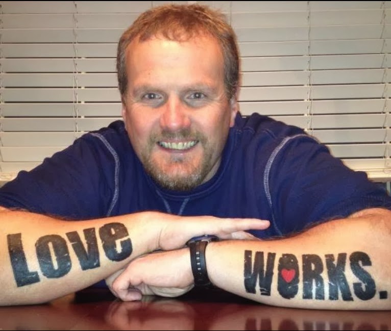
This project was for a counceling group some family are working with. They needed a new youthful and positive brand identity. 

The client was so happy with the work he made a full commitment to the branding. Yes that's a real tattoo.


This was a fun, quick project for an iphone app. I was happy at how readable it was, even at app icon size


This was a painting I finished as a gift to my parents. They moved to North Carolina a few years ago and I wanted to give them something that would remind them of Maine.


This was a couple illustrations I did for Dr Ross Greene's annual Lives in the Balance Conference. This was a great chance to combine pen and ink illustration with photoshop coloring. The great benefit of doing the color in photoshop is if you mess up, you don't have to re-ink the whole thing like we old timers used to have to do.

I'll try and get some more stuff up soon - there's been lots going on.

Thursday, December 06, 2012

PROJECT: Illustration for 'Lives in the Balance' Conference

One of my clients asked me to do an illustration to be used for poster art, coffee mugs and other media for his upcoming conference. We met and discussed various text items that needed to be included as well as what kind of imagery he was looking for. It was to have a Maine theme focusing on children learning. Here is the result.


It was a really fun project that was completed concept to final art within a week. I used pen and ink for the main part of the illustration, then colored a high resolution scan in photoshop. I then brought the entire piece into Illustrator where I incorporated the text. I'm happy to say, we're already discussing what next year's conference art might look like.

Tuesday, September 18, 2012

PAINTING PAINTINGS

As summer meandered its way along this year, I decided to try and take a different approach to pushing my creative buttons. My friends at Maine Home Accents suggested I start painting again since I had painted their windows. They provided me with a couple panels to get started. I was excited to try out a new medium to paint on as I had always painted on canvas or linen. Once I primed the wood panel, I had to decide what to paint for the first time in 17 years. I figured, stick with Maine as the theme since it's going to be for sale in a home decor store. I thought about doing something I had never tried before and a fish came to mind. After some image research I really liked the colors and reflective qualities of the Maine Black Crappie (Yes, I know, I did a crappie painting) Anyway, here's what ended up coming off my brush.
Maine Black Crappie

After tackling that topic and being pretty happy that my painting skills hadn't really diminished, aside from my eyesight. (The over 40 curse) I wondered what I could do next. Dinner that night had the answer for me. Since I was trying to gear this work toward summer visitors' interest, I decided to dive whole hog into a Lobster. I wanted to give it a special "Maine" feel, so I added the text of Maine behind it. Aside from the crooked cropping from my iphone photo, this captures the colors pretty accurately
Maine Lobster

I was now in lobster land. I wanted to do another take on it. I felt this should have a rustic appeal that someone might hang in their camp kitchen or dining room. Fortunately my friends at Home Accents had a bunch of well weathered picket fence sections. I grabbed a handful of them with the intention of making a panel out of the pieces. Then I decided this lobster would be red and more of a caricature, rather than trying for anatomical accuracy. I went with essentially the same Maine text theme and voila:
Lobster Picket

I finally started catching my stride. I wanted to keep doing what I hadn't aggressively done in more than 20 years since Art School. It was at this point a few friends on Twitter had noticed these pictures as I began posting them. One friend had asked if I could do something more scenic. We chatted back and forth about the majesty of trees and how the human form could be seen in many of them. I ran with the idea as she gave me the go ahead. I also decided to stretch my own canvas. Again, it all came back to me as I went through the processes. Once I was ready to paint, I recalled all those William Alexander/Bob Ross moments I watched faithfully as a kid and started going at those "happy little trees".
Strength Against the Elements

After completing this one, I realized how much I loved doing trees. I really wanted to understand the different types and how weatherworn they can be, so I decided to do a series of trees as a study. I had a bunch of small 12x8 panels so I collected them all and started trying to capture different elements of Maine coastal trees.
Sun Bleached Sentry
Wind Whipped
Sunset Branches
Hiding in the Rocks

Flailing in the Fog
So now that I had the trees out of my system, I wondered what I could do next. I realized that Autumn was fast approaching, so I remembered some photos I took of leaf textures on the ground in my yard. This would be a good opportunity for me to also work thicker with the paint in my endless effort to get a more 'painterly' technique.

Autumn Palette

At this point I had caught the eye of several other online friends and had been asked by someone to complete a large piece as an anniversary gift for his wife. This was to be a big challenge as the topic was a scene in downtown Portland. Also I had to try and capture the proper time of day and include some other personal elements. Long story short, here's the finished piece. Local Portlanders should be able to recognize its location.

One Longfellow Square
Now, ecstatic that I overcame several challenges with this last piece, I had the opportunity to do another tree piece, in a more muted, monochromatic technique. I got to break out the palette knives for this one because I wanted to capture chunky rock textures. Also, I got to add fog - something that can be very challenging when working with acrylics because of their quick drying time.

Above the Ground Clouds

At this point, I have several others in the works and will share them in subsequent posts. If anyone would be interested in having something done for them, please don't hesitate to contact me about the details. I finally found something I love to do that also brings joy to others. It's funny how life takes you around full circle sometimes and you realize that what made you happy earlier in life is exactly what makes you happy now.


Tuesday, July 24, 2012

JACK GRACE BAND

It's that wonderful time again when I get to create another album (CD) cover for the inimitable Jack Grace. This process and partnership was established as a collaborative process from the very beginning back in 1998. Jock's colorful music has evolved over the years - as has his album artwork. I've been fortunate enough to be an integral part of the whole creative process for every one.

Our first priority was to create a new logo and tagline for the band that could be used as the basis for stickers and t-shirts and other swag. Jack had a great vision as the the feel of this one, so he went and actually drew it. He even used rulers and markers -a very impressive effort - one that was the basis for the final approved artwork here:


This will be used in a variety of ways on a multitude of mediums. Next step will be to create the CD package and the actual disc artwork. I'll be sure to share in not only the finished product, but also the process as it comes along. Stay tuned.

Friday, June 08, 2012

CeNita Vineyards & Cooperage

I got the assignment to develop a log for a vineyard named CeNita that would also have a separate cooperage (barrel making) business as well. After getting the overall story of the family heritage and getting a good sense of the style they were looking for, I went to work on an exploratory.


The client was attracted to the tree/roots combination and asked for further refinement.

I went two routes, one being the more "bendy" iconic vineyard type tree and one that was more native to Northeast Georgia where they're located. After an internal debate among the other shareholders, it was decided to combine several elements from the intial exploratory.


It was at this point I was also asked to illustrate a barrel graphic to incorporate with the Cooperage logo - which would help differentiate it from the vineyard while still staying with the parent brand. Now came time for the final decision based on the 3 options provided. 


This was a fun project because a lot of the brand personality had been firmly established to this point. I look forward to seeing this artwork on bottles, printed material in the not too distant future.


I Made a Mashable Article!!

Good to see that playing in Photoshop can sometimes pay off (at least in traffic)

Monday, September 26, 2011

GIRL SCOUT DROPOUT


This past week was the illustrious launch of girlscoutdropout.com. An exciting project pinnacle to reach - especially when collaborating with such lighthearted and visionary folks. Sandi Amorello of irreverentwidow.com was the original brainchild for the project. She was inspired to develop this with a combination of her artistic and creative vision coupled with all the positive feedback she got from colleagues when mentioning the idea. Once again, I had the pleasure to work directly with Chris Kast of The Brand Company fame - an immensely talented individual who is an essential lubricant to the gears of creation and ideation. Nathan Hankla breathed life to the website by taking our core design and creating simple functionality. We brought our collective skill sets together to create the entire breadth of material needed, which included original brand/logo development, branded premiums, product and attire, print collateral and corporate identity design as well as the complete website development and social media presence. It was a colossally scaled, yet extremely fun and rewarding experience that we all had the pleasure to share right from the beginning.


I'm also very happy to see the launch even got us some press. That's us in the photo with PR expert Angie Helton. All of us are looking forward to seeing this great, fun, celebratory idea get some traction and spread like kudzu to all dropout's everywhere.

Wednesday, August 24, 2011

A Coronation (evolution)


To be very brief, my friend Josh made a fantastic suggestion when he saw my skull/Brand Royal logo. I took his suggestion, and couldn't be more psyched. I love watching a brand evolve before my eyes. In fact, I'm seriously considering a limited run t shirt.

NICE TO SEE WORK IN ACTION


A couple month's ago, A friend Leigh asked if I'd be able to do a logo design for team t shirts she needed for this year's Great Adventure Challenge at Pleasant Mountain in Bridgton Maine. She gave me the the two teams' names - 'No Nuts, Just Guts, and No Guts, Just Nuts' which IMMEDIATELY got the ol' idea machine rolling. In the image above you'll See the final results. The ladies, as always showed an impressive performance in a tough race. Extra shout out to my wife Amy who has had an amazing season of triathalons and the like. I couldn't be prouder of her. I'm also really glad I got to contribute a little additional style to an already exquisite looking group of ladies.
Below are the 2 selected logos before the final choice was made.


Tuesday, July 26, 2011

Finally, an ad


I've always heard landscapers often neglect their own lawns. I understand this now having been in business full time for almost 3 years without creating a Brand Royal ad for print. Thanks to my collaboration with Rachel Flehinger and the Portland Improv Festival, I'd say the drought is finally over.

Wednesday, June 15, 2011

DEFENDERS of the FUNNY

Got a chance to develop a logo for our hatchling improv group. The group chose this one (with a close 2nd to be posted soon) Love the juxtaposition of the peaceful buddha with a samurai sword, laughing in flowers. #Paradox anyone? Many thanks to Rachel Flehinger who helped bring our name and entity across the finish line. Looking forward to some good performance opportunities in the coming months. Stay tuned. Oh yeah, here's the grayscale version...

Thursday, April 28, 2011

Successful Thinkers Overview

Over the past year, As an advisory board member with Successful Thinkers I had theopprtunity to design all the event flyers. Below is a selection of what I haven't already posted before and are self-explanatory. As always, a great opportunity to just let the creativity flow.


Thursday, October 28, 2010

Successful Thinkers Event at the Maine Military Museum


Another poster/graphic that we created for the next Successful Thinkers event. Since it was military themed scouring through old historical "Buy War Bonds" posters was essential for inspiration. If you're familiar with my other blogs, you'll understand the enthusiasm for military themes.

Last Day on Sebago Lake


My friend Mike called me out of the blue to come spend the day on Sebago lake so he could flush out his boat before winterizing, and for peak fall foliage camaraderie. I couldn't pass up a chance to not only spend some fresh air-off-keyboard time, but also the chance to get some great fall pics before the leaves drop. OK, sure, I used 'Hipstamatic' for iphone, by I say it still takes a decent eye to catch a REALLY good shot. Hope you enjoy.


Saturday, September 04, 2010

Successful Thinkers Flyer


I was quite happy with the way this came out. I found a decent vintage racing image and pretty much stripped everything out of it except for the car, background and silhouettes. Everything else needed to be squeezed in a somewhat unique shaped space. Should be a fun event.

Thursday, April 15, 2010

NEW BUMPER STICKER


I figure this is as good a place as any to start keeping score of the little visual creative tidbits that happen now and again. This was an IM conversation between Bob B & myself just this morning. Thanks for noting it's bumperstickability Bob. :)